The second week after New Year focused on experiments with visualizations of book data, using “short-form”, exploratory methods. These initial visualizations included network diagrams, maps and scatterplots. Before testing out these types of visualizations in a user setting, they will be refined further additional metadata elements available in the library catalog, and visually restyled.
Specific activities
- Creating sample visualizations of book data (using the D3 framework)
- Using “short-form” methods, i.e. “quick and dirty” methods to explore data and visualizations, being the first step before further development
- This required data processing, and creating ways to utilize our data structures
- Sample visualizations included (interactive) bar charts, network diagrams, word clouds, geographical maps and scatterplots
Summarized in here in News post
- Visualizations will be further be extended, refined and tested in the coming two weeks
- The initial visualizations were the following, each with distinct advantages and drawbacks, for instance their suitability for small vs. large screens, their novelty and their usability:
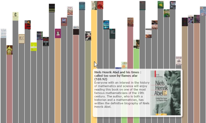
Interactive bar chart (showing 2 dimensions of data, ratings and classification, possibility to reorder).

Network diagram, showing relations between classification codes and books

Word clouds, showing words occurring in abstracts of books
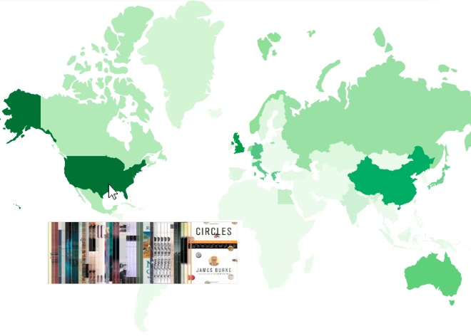
Geographical maps, showing the locations related to books, in this case Collection 42 (using location subject headings)

Scatterplot, using book covers, showing classification codes in horizontal dimension, and book ratings in vertical dimension